Missing the Frye lately?
What if we told you that you can still experience art all around the Frye without even going inside the Museum? We hope you’ll enjoy this self-guided tour. Let’s start with the building itself.
To begin your self-guided tour, find your way to the sidewalk of Terry Avenue at Cherry Street, facing the front entrance of the Museum.
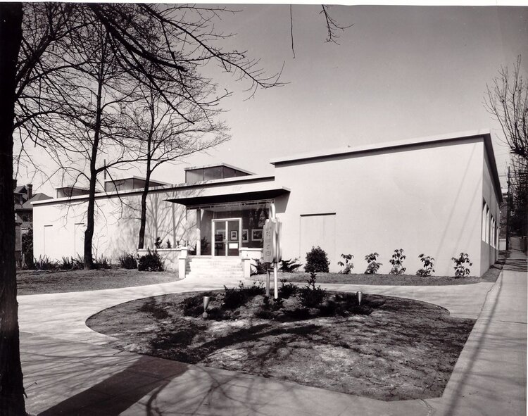
Exterior of the Museum facing Terry Avenue in 1952. Photo: Frank Jacobs
When the Frye Art Museum first opened in 1952, it looked quite different. Designed by renowned local architect Paul Thiry, the Museum showcased the collection of Charles and Emma Frye, prominent early-twentieth-century Seattle business leaders and art collectors. Over the years, different galleries and spaces were added on to the original structure. In 1997, Olson Sundberg Architects (now known as Olson Kundig) was hired to renovate the Museum to make its spaces feel more unified and to modernize the building.
Your current view features some of the elements that Olson Sundberg Architects added including:
-
Reflecting Pools
-
The sound of water has a calming effect and serves as a way for the visitor to feel like they’re entering a different space. It sets up an atmosphere separate from the sidewalk or street.
-
Light can bounce off of the water into the galleries.
-
-
Columns & Arcade
-
The simplified columns that flank the entrance ramp—which may bring to mind the classical architecture with which many museums are associated—form an arcade, an architectural element that dates back to ancient times. In addition to serving as a covered walkway, the arcade helps unify the different building additions that were added on to the original 1952 structure.
-
-
Ramp
-
The ramp is an example of universal design and is also seen as an equalizer—anyone can use it to enter the Museum, thus serving as a metaphor for access and the role of a free museum.
-
As you walk from the sidewalk to the Museum entrance via the covered ramp, your pupils expand, allowing the eyes to adjust slowly to dramatic light changes (from bright sunlight outdoors to softer lighting in the galleries).
-
-
Rotunda
-
The rotunda was designed to accomplish a few different things. Not only is this the space where visitors converge after entering via the ramp or the stairs, the architects wanted to create “a powerful landmark in the neighborhood” (Olson Kundig).
-
In architectural history, the dome shape has always been significant. Here, the rotunda is meant to be iconic and to distinguish the Museum from the other building types in the neighborhood.
-
-
Café
-
The addition of a café was integral to the Museum meeting its goal to be a part of the community.
-
-
Courtyard
-
The courtyard serves as a transition from outside to inside and vice versa. Since it goes up to the sidewalk edge, it allows the sounds of people and conversation to spill out onto the sidewalk, becoming a community space in the neighborhood while still serving as “museum space” because of the laced grating that blocks it off.
-
The moss dome in the courtyard’s interior is made out of concrete and its shape is the inverse of the rotunda.
-
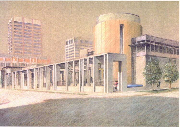
Architect’s drawing of the Frye Art Museum. Olson Sundberg Architects.
Essentially, the architects designed an entry sequence—a specific experience for visitors coming to the Museum allowing a gradual transition from outside to inside. They built in distinct moments where noise and light are minimized incrementally to allow the visitor to adjust from being outside to entering a museum space.
Now, let's make our way towards Cherry Street, turning left towards Boren Avenue. Stop about halfway up the block when you spot one of these:
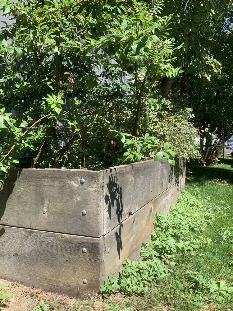
Photo: Michelle Cheng
Recognize these objects? The planter boxes found along the sidewalk are a part of the Pollinator Pathway, an interdisciplinary design project created by Sarah Bergmann that was installed in conjunction with the Genius / 21 Century / Seattle exhibition (2015). Bergmann hoped that the project would help people rethink their relationships with nature, especially in urban settings. The Pollinator Pathway stretches over a mile from Seattle University in First Hill to Nora’s Woods in Madrona, focusing specifically on underused space (such as planting strips owned by the City of Seattle) and featuring native plants that encourage pollinators.
Genius was a large-scale celebration of multidisciplinary and collaborative artistic practice in Seattle in the twenty-first century. It featured over sixty-five visual artists, filmmakers, writers, theater artists, composers, musicians, choreographers, dancers, and arts organizations who had received The Stranger Genius Award. The Frye Art Museum is itself a recipient.
Let’s continue up Cherry Street towards Boren Avenue for our next stop. You might have perhaps mistaken the yellow form for a misshapen guardrail, instead of an original work of art!
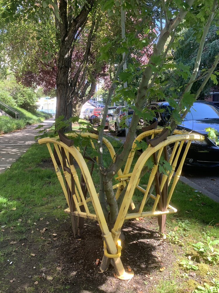
Buster Simpson. Tree Guard, 1978/2013. Powder-coated cast iron. 42 x 32 x32 in. Gift of the artist, 2013.13. Photo: Michelle Cheng
-
Take a moment to look closely at this artwork. What do you notice? Feel free to get up close to it. What is this artwork made of?
-
How would you describe the relationship between this artwork and the tree? Why do you think the artist chose these materials?
The artwork you’ve rediscovered is made by Buster Simpson, a Seattle-based artist who is a pioneer of urban environmentalism and art in public spaces. In 1970s Seattle, Simpson noticed that many trees were either suffering or quickly disappearing from the city's streets as buildings were demolished and the streetscapes continued to change. To protect the newly planted or most vulnerable trees in what came to be known as the First Avenue Urban Arboretum, he used crutches to support tree limbs and salvaged bed frames from hotels along First Avenue in Belltown that he repurposed into low-cost tree guards. The bed frames would deteriorate over time, so in 1998 Simpson developed a foundry pattern using bed frames and crutches that would allow the tree guards to be cast in iron in order to last longer. Once trees reach a resilient size, the tree guards are meant to be reused in another location.
As for this particular cast iron Tree Guard, it was originally placed around an older tree on Terry Avenue that was located at about the middle of the block as part of BUSTER SIMPSON // SURVEYOR, the artist's 2013 exhibition at the Frye. A few years later, Tree Guard was moved to the young vine maple tree you see here, which is native to the area and was planted as part of a Family Day celebration at the Museum.
Next, make your way towards Boren Avenue and turn left. About halfway up the block, you will find our next and final stop.
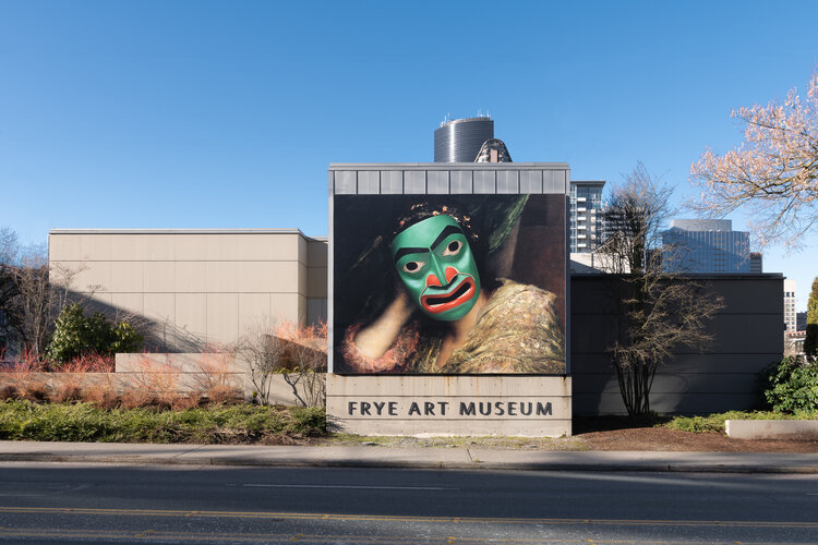
Banner image: Alison Bremner. Goonaxh Sá (detail), 2017. Digital print. Photo: Jueqian Fang
-
Take some time to observe this artwork. What do you notice first? What more can you find?
-
What do you notice about the figure’s face in this artwork? How does it compare with the rest of the image? Where might you have seen these styles of art before?
This banner is a reproduction of Goonaxh Sá by Tlingit artist Alison Bremner, made for her exhibition One Gray Hair which opened at the Frye in 2017. Born and raised in southeast Alaska, Bremner is passionate about maintaining and revitalizing Tlingit language and culture, which is evident in her work across different mediums, including painting, sculpture, digital collage, and regalia (clothing and ornaments designed for formal occasions). This artwork’s title, “Goonaxh Sá,” is a Tlingit phrase said after one sneezes. You may notice that there is an underlying painting, which is Gabriel von Max’s Pause (At Rest) from the Frye’s Founding Collection. It was on view at the same time as Bremner’s exhibition in an adjacent gallery as part of the Frye Salon. Max’s painting depicts a woman deep in thought; in Bremner’s version, the woman now wears a mask—one that Bremner herself carved, depicting a face in mid-sneeze. This artwork represents a key element of her artistic practice: subverting dominant images and narratives, using humor to counter the patriarchal and racial bias of the art historical canon by digitally manipulating a European painting with a mask in the style of Native art.
Curious how the banner made its way to the exterior of the Frye? Here’s how it was done:
Thank you for joining the Frye on this self-guided tour. Hopefully, you’ll be inspired to find art in your own neighborhood, or anywhere you go! Please share your photos with us on social media using #FryeFromHome.
References
Olson Kundig. “Frye Art Museum.” Olson Kundig. Accessed 9/1/2020. https://olsonkundig.com/projects/frye-art-museum/.
Michelle Cheng
Director of Education & Community Partnerships