We are excited to announce Frye x Design, a new annual poster series that invites local designers to create work inspired by the museum. The poster is displayed in the Frye Courtyard and available for purchase at the Frye Art Museum Store. This year's inaugural poster was designed by Jayme Yen. She is the co-organizer of the Seattle Art Book Fair and has taught publication design and information visualization at the University of Washington School of Art + Art History + Design. We asked Jayme to share some insight in to her design and process behind the poster.
By Jayme Yen
This project started by thinking about reading, mapping, and orientation—about the ways texts orient us to ideas and maps orient us to places. But what about art? How does looking at art orient us to the world around us? Can reading and writing be a form of orientation? Can a map be made entirely out of text? Could someone look at a work of art for long enough until it reveals something new?
In the initial project stage I collected examples of art and design that relate to the questions I wanted to explore. Vija Celmins, whose drawings and paintings I could stare at forever, uses the term ‘redescription’ to describe “a process of translating photographic images from one medium to another . . . the resulting work possesses a magical verisimilitude that compels the viewer to look more closely.” I was intrigued by the idea of making something that could reward lengthy looking or multiple inspections. I was also reminded of art that prominently features text, offering multiple ways of seeing (and reading) an artwork. For example, the works in Tavares Strachan’s solo show at the Frye (Tavares Strachan: Always, Sometimes, Never, January 27–April 15, 2018) that looked like found images printed directly to encyclopedia pages. Or the large-scale photography and videos inscribed with handwritten text as well as the wall-sized calligrams in Sky Hopinka: Subterranean Ceremonies (February 17–May 26, 2024). I also love the type experiments featured on @designingwriting, an Instagram account run by Alex Balgiu as a ‘cabinet of curiosities’ for visual poetry and typography. A lot of these experimental works allow the eye to travel, with the words tracing paths on the landscape of the page.
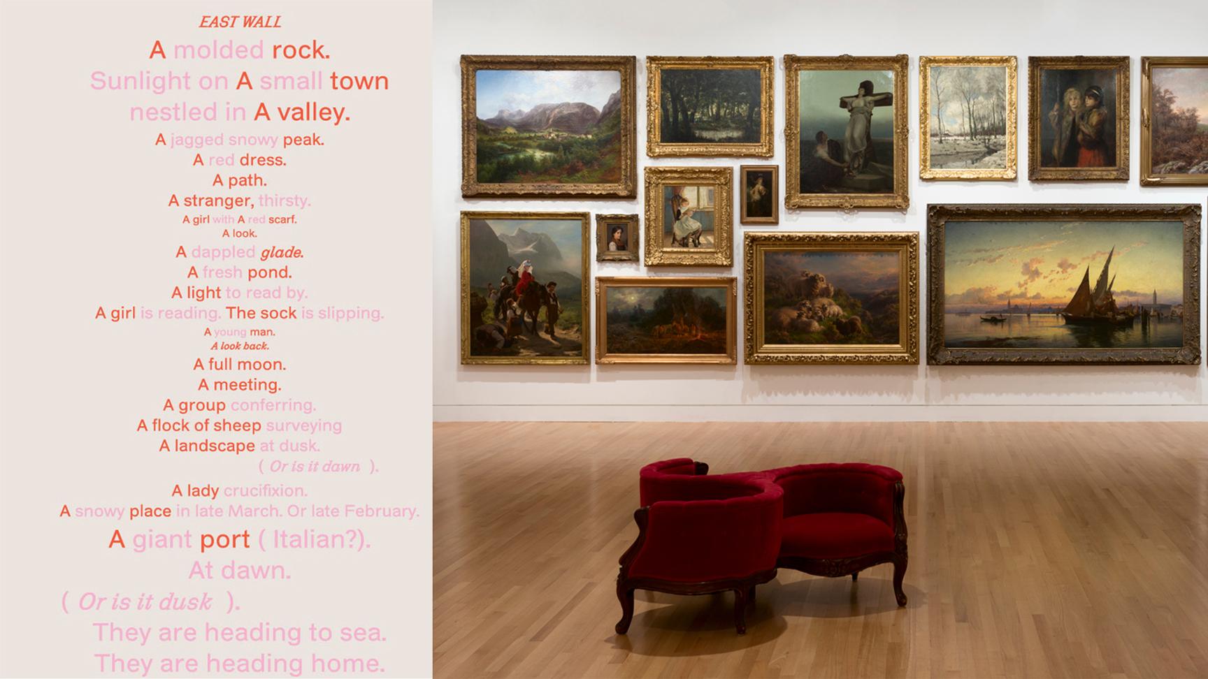
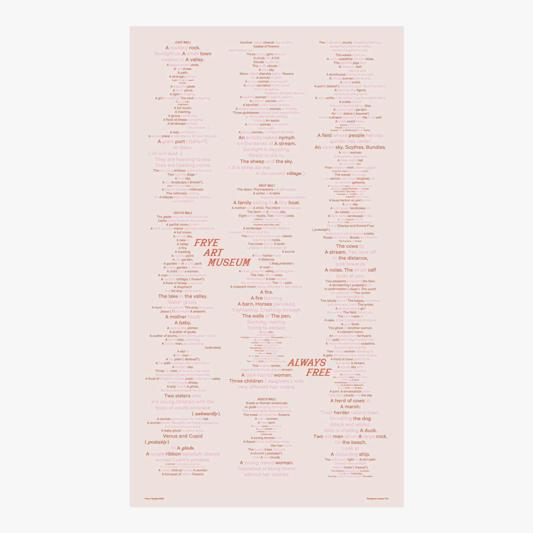
I considered spaces at the museum that could be mapped through text. I’ve visited the Frye Salon many times; the salon-style method of installation can be read like a visual list of ideas around work, leisure, and morality. The combination of many paintings can also be seen as a form of writing, with the curatorial team as author and visitors as readers. What if the Salon could literally be translated into text, and this text form an alternative map of a physical space?
For a few hours at the Frye Salon, I wrote down what I observed as the “nouns” of each painting—people, sheep, cows, lakes, mountains, etc. To keep the list of subjects succinct, descriptions were kept minimal. Starting from the top-left corner, each wall was read like a page, with the paintings forming ad hoc columns of text.
I transcribed my notes into a Google Doc, where I introduced simple typography like indents and italics. This draft allowed me to see patterns in the writing, and I became interested in the difference between things I noted as ‘A _____’ versus ‘The____’—or things I had decided were general examples versus unique concepts. I could also see the parallels between artworks on opposite walls, as well as where clusters of similar-themed paintings occurred. It was not hard to tell which works elicited a greater reaction from me compared to others.
To go further with the typography, I dropped the text into InDesign. Subjects and descriptions were assigned different colors; alternating between darker and lighter shades to create a slight ‘flicker’ effect when seen from a distance. The size of the type changed according to the actual scale of the painting—the largest font size corresponds to the largest paintings, the smallest point size to the smallest paintings, etc. Personal commentary and interjections were italicized and kept in parentheses. These various visual hierarchies offer the viewer multiple modes and speeds of reading. The meandering path of text traces my attention and experience of the Frye Salon on that particular visit.
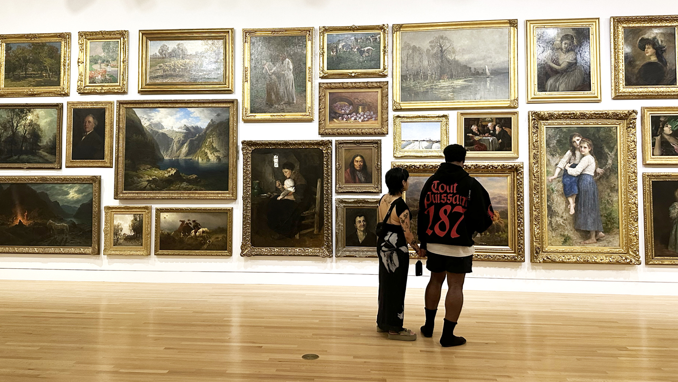
An afternoon in the Salon. Photo: Jayme Yen
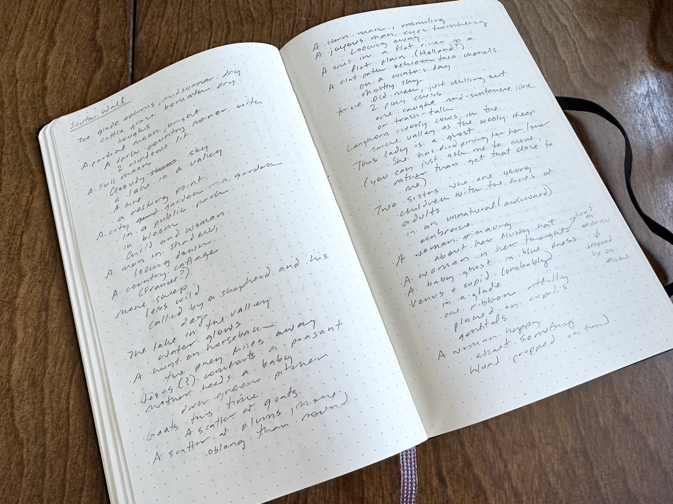
Jayme's notes from the Salon. Photo: Jayme Yen
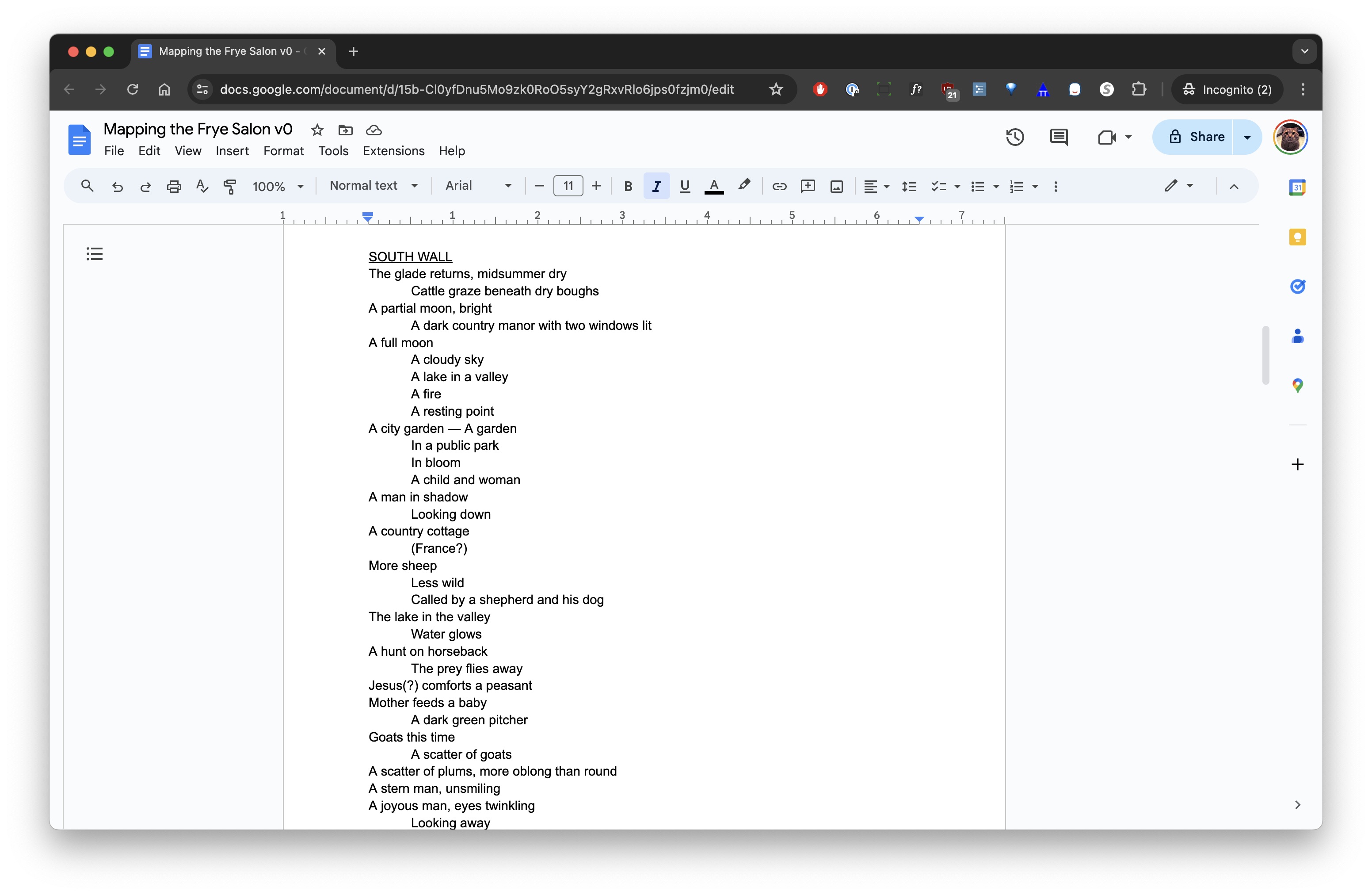
Starting to work with the Salon notes. Photo: Jayme Yen
As a slow writer, it was a joy to generate text that’s a mix between ‘found’ and personal. Having occasionally tussled with clients about minor design choices (underlining text is extremely controversial!) I had a great time creating and playing with a different typographic voice.
It’s thrilling to think that everyone’s map of the Frye Salon could look a little different, because we have different ways of noticing and experiencing art. I hope everyone tries making a visual poem on their next visit to the Salon—to better understand their own way of seeing and to realize a new reading (and a new map!) out of existing art.